
Paint color trends for 2027
The 2027 colors of the year, and where each one works in your home.
Green leads the way in 2027.
Benjamin Moore, Sherwin-Williams and Behr all picked a green for 2027: a classic mid-tone, a soft yellow-green and a deep olive. Many of the other brands went with smoky blues and warm earth tones.
Benjamin Moore says its team focused on greens because they “consistently demonstrated remarkable staying power.” That makes green a safer bet than most trend colors.
The 2027 colors of the year
Each room is a styled example painted to match the brand's published color. Paint shifts with your own light, so look at a real sample on your wall before you choose.
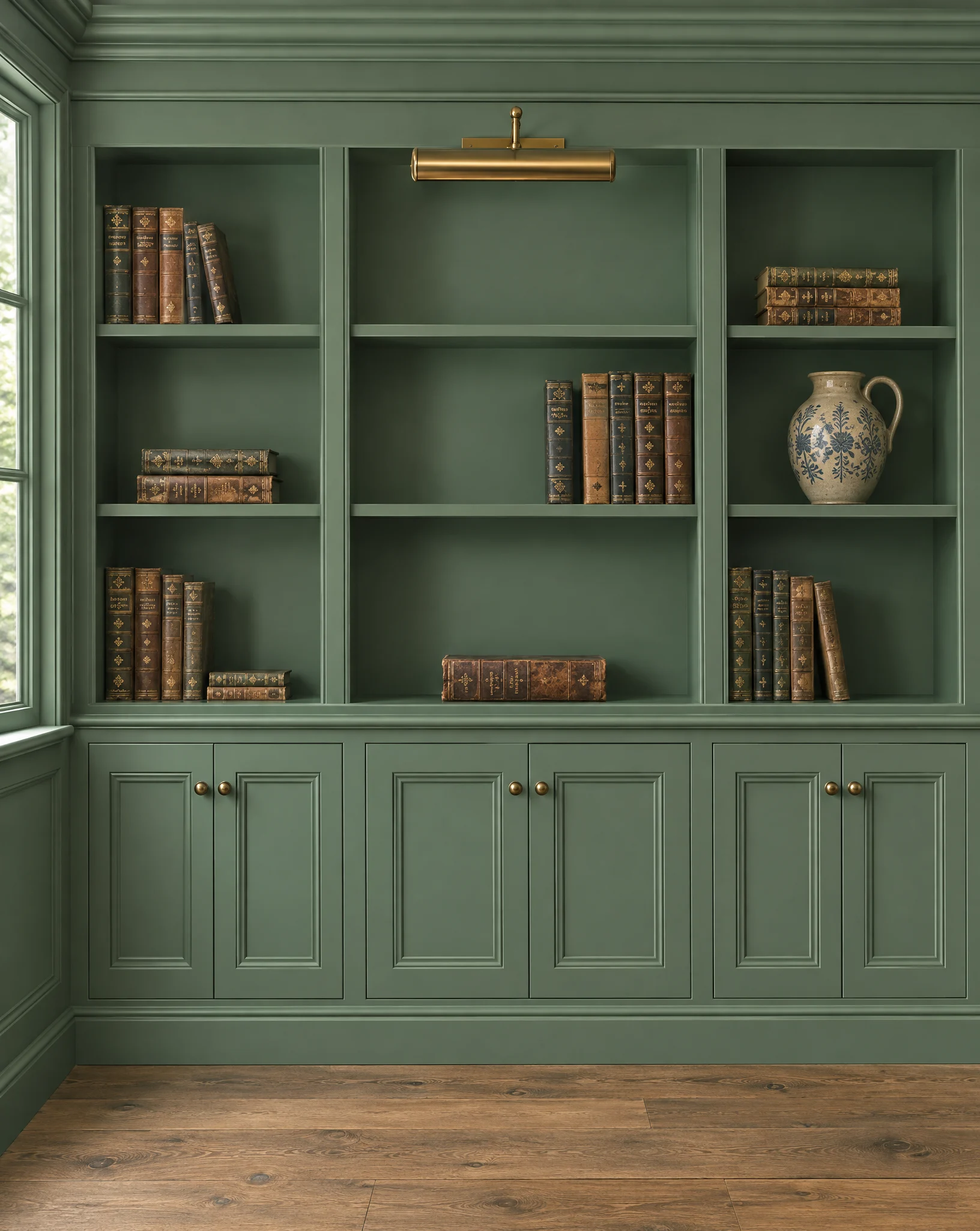
Webster Green
A classic mid-tone green from Benjamin Moore's Historical Colors collection. The brand chose an established color on purpose, a green meant to outlast the trend cycle.
Where it works
Benjamin Moore suggests it in small doses on cabinets or trim, or on every wall of a room for a wrapped-in feel. It even suggests it with red brick, a pairing that suits plenty of homes around Boston.
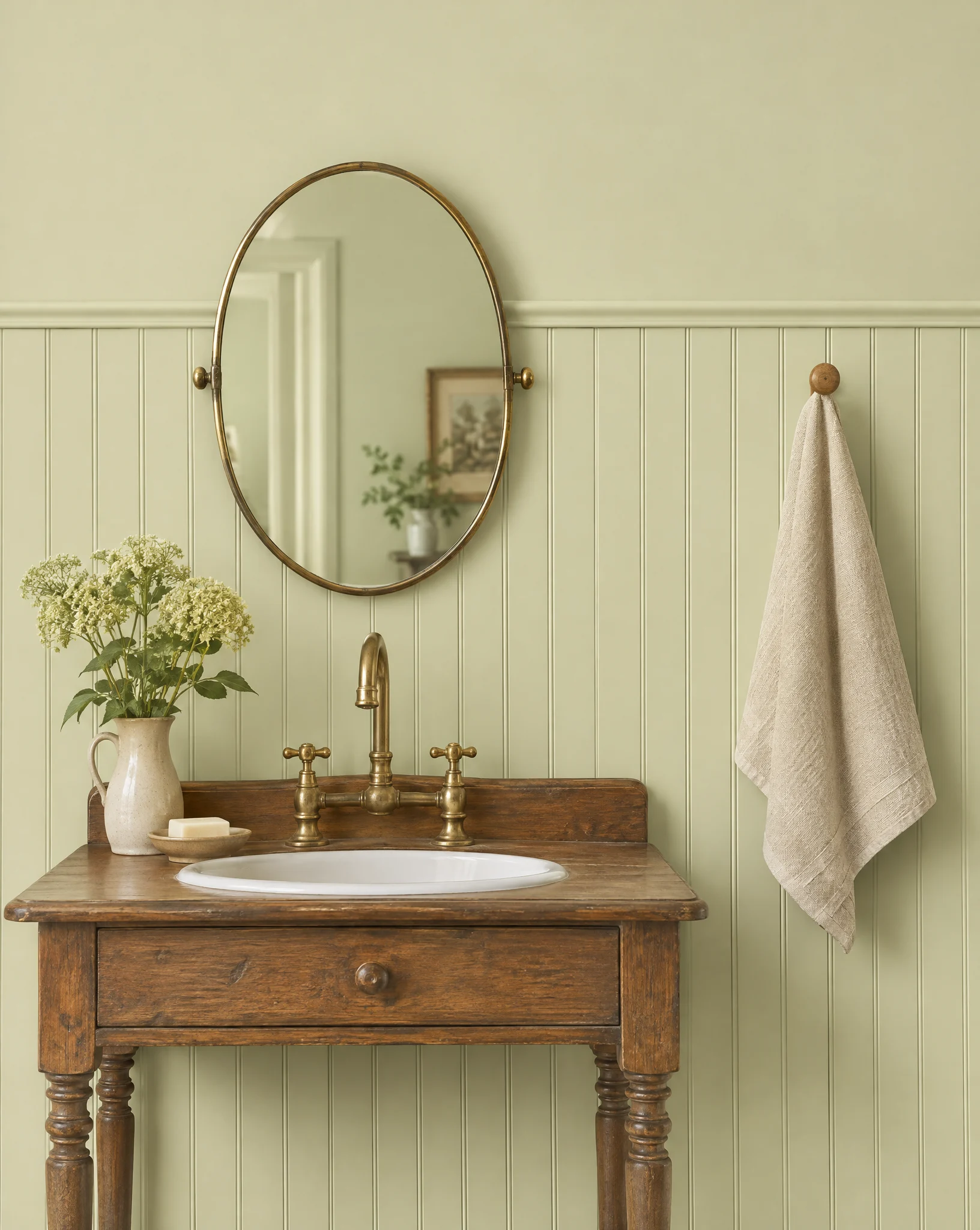
Celery
A soft, muted green with warm yellow undertones. It is the lightest of the big picks, light enough to work as a fresh neutral.
Where it works
Sherwin-Williams points to millwork, bedroom and bathroom walls, front doors and even exteriors. In a bright, sunny room it can read almost cream, so look at a sample there first.
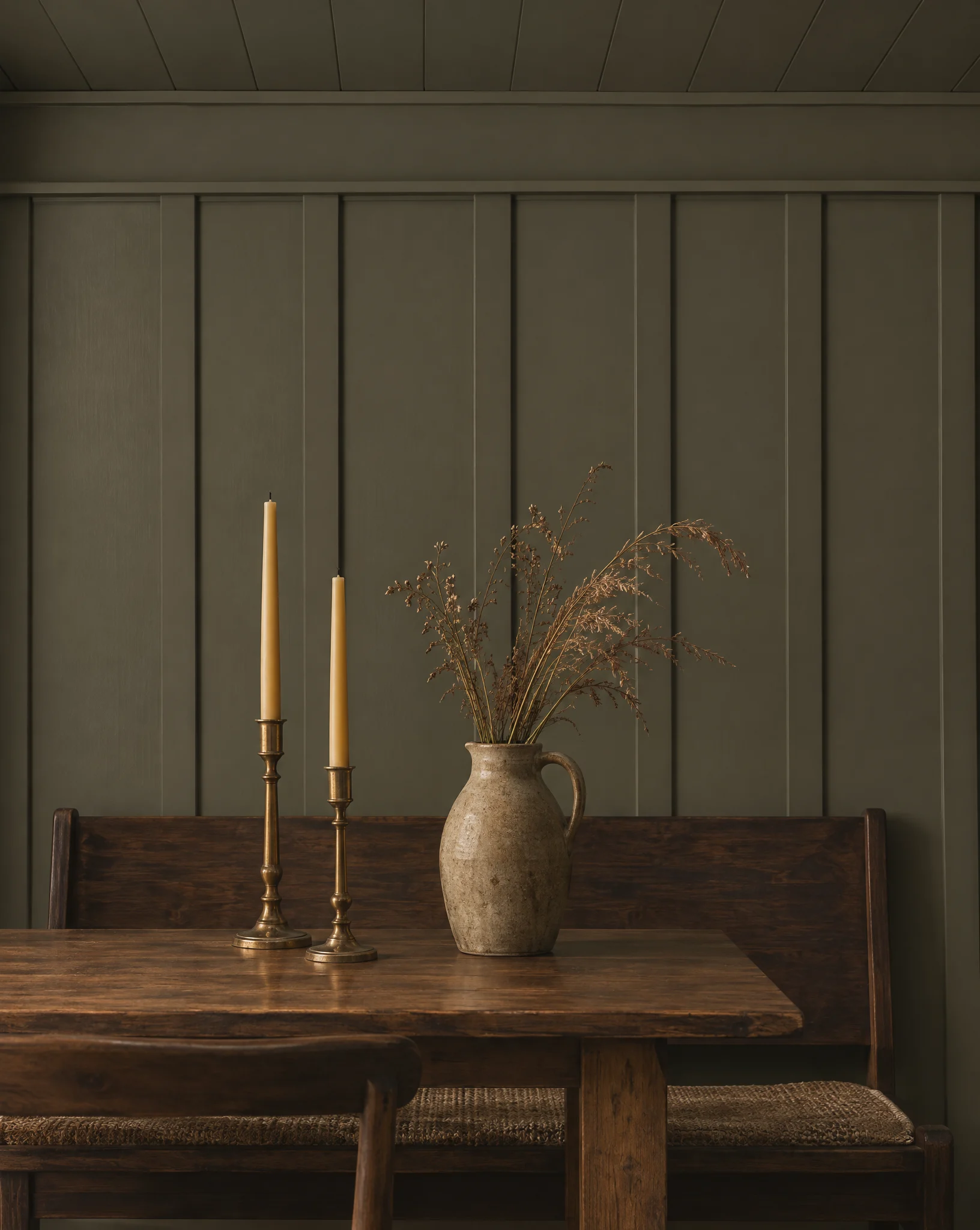
Grounded
A mossy olive with earthy brown undertones, newly made for 2027. It is the deepest of the greens.
Where it works
Behr says it works inside and out. Use it where you want a room to feel cozy: a den, a dining room, a bedroom, or a kitchen island under lighter counters.
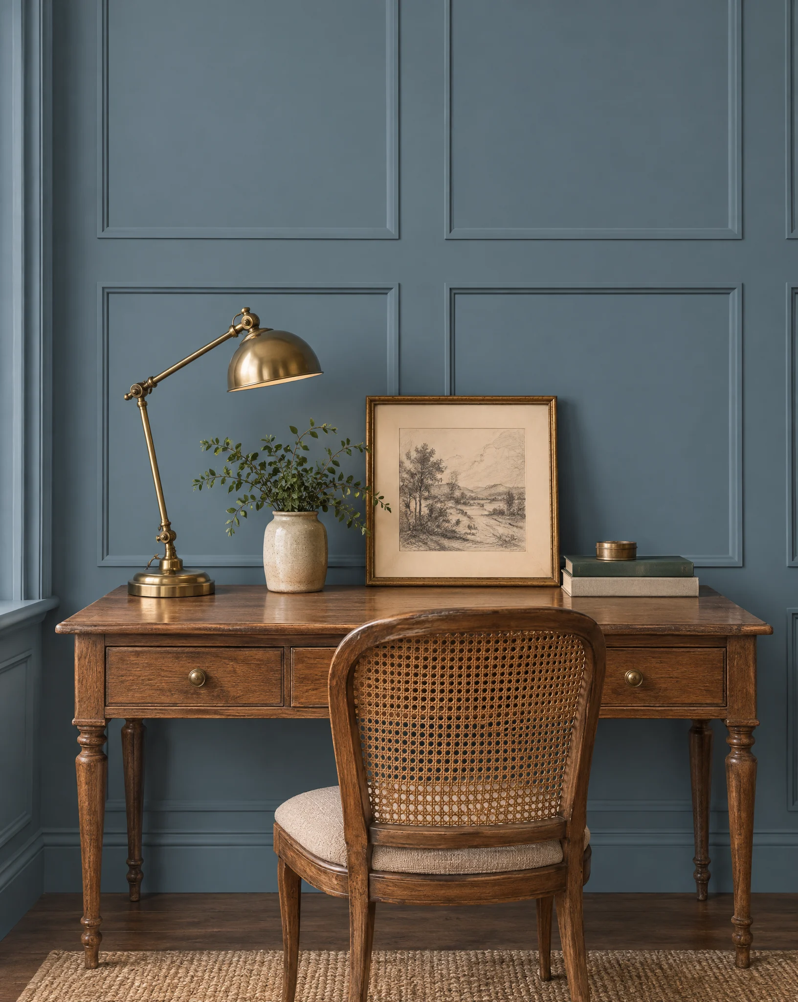
Artifact
A warm, smoky blue that behaves like a neutral. Glidden picked it as a calm step away from cool grays.
Where it works
Glidden suggests it anywhere that needs a little calm: a living room, a home office or a bedroom. If your rooms are gray now, it is an easy next step.
Deep Rooted
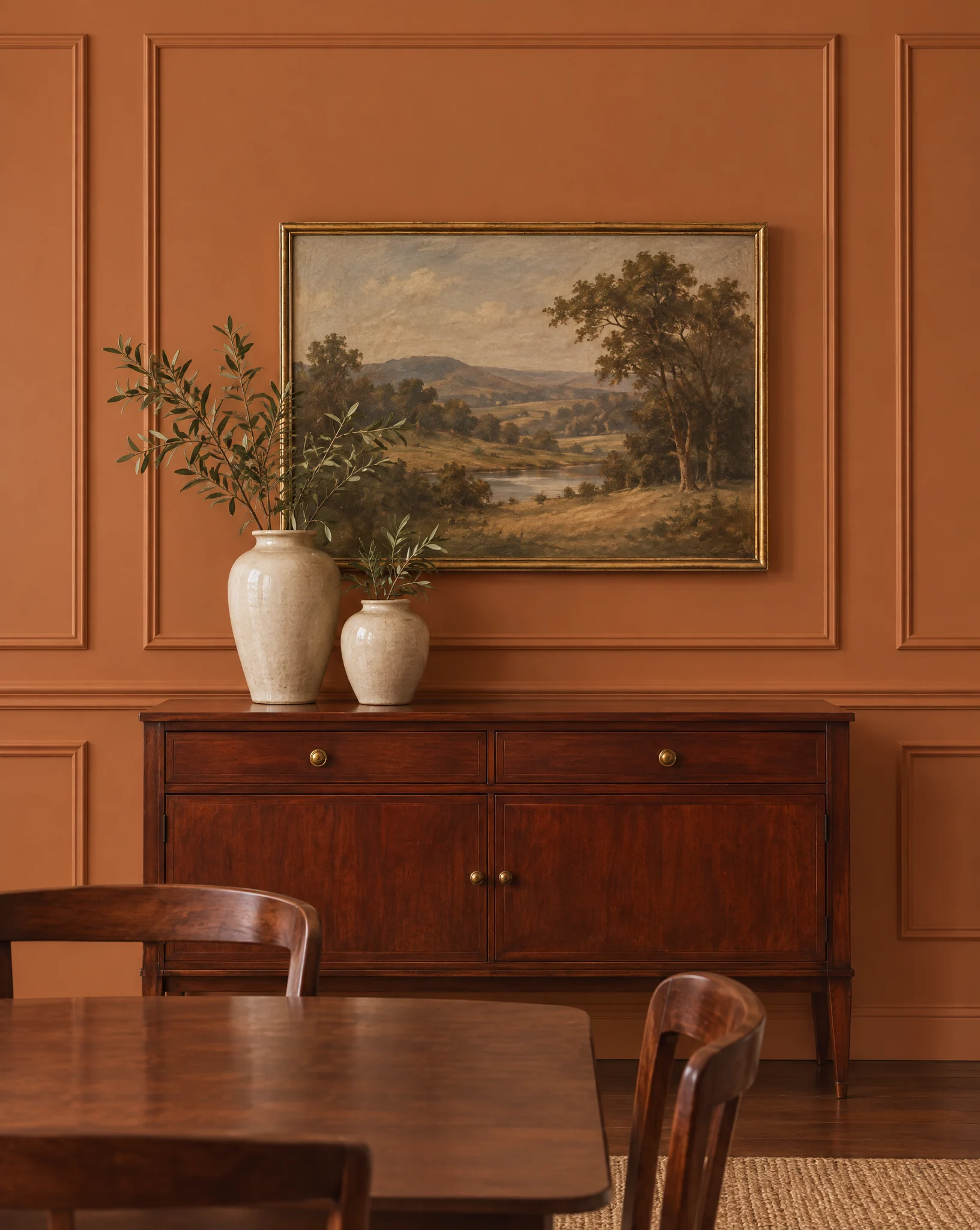
A rich, earthy orange close to terra-cotta, and a bold change from Dutch Boy's soft ivory pick for 2026.
Where it works
Save it for a room you want to feel warm and lively: a dining room, an entry or one accent wall.
Bonus pick
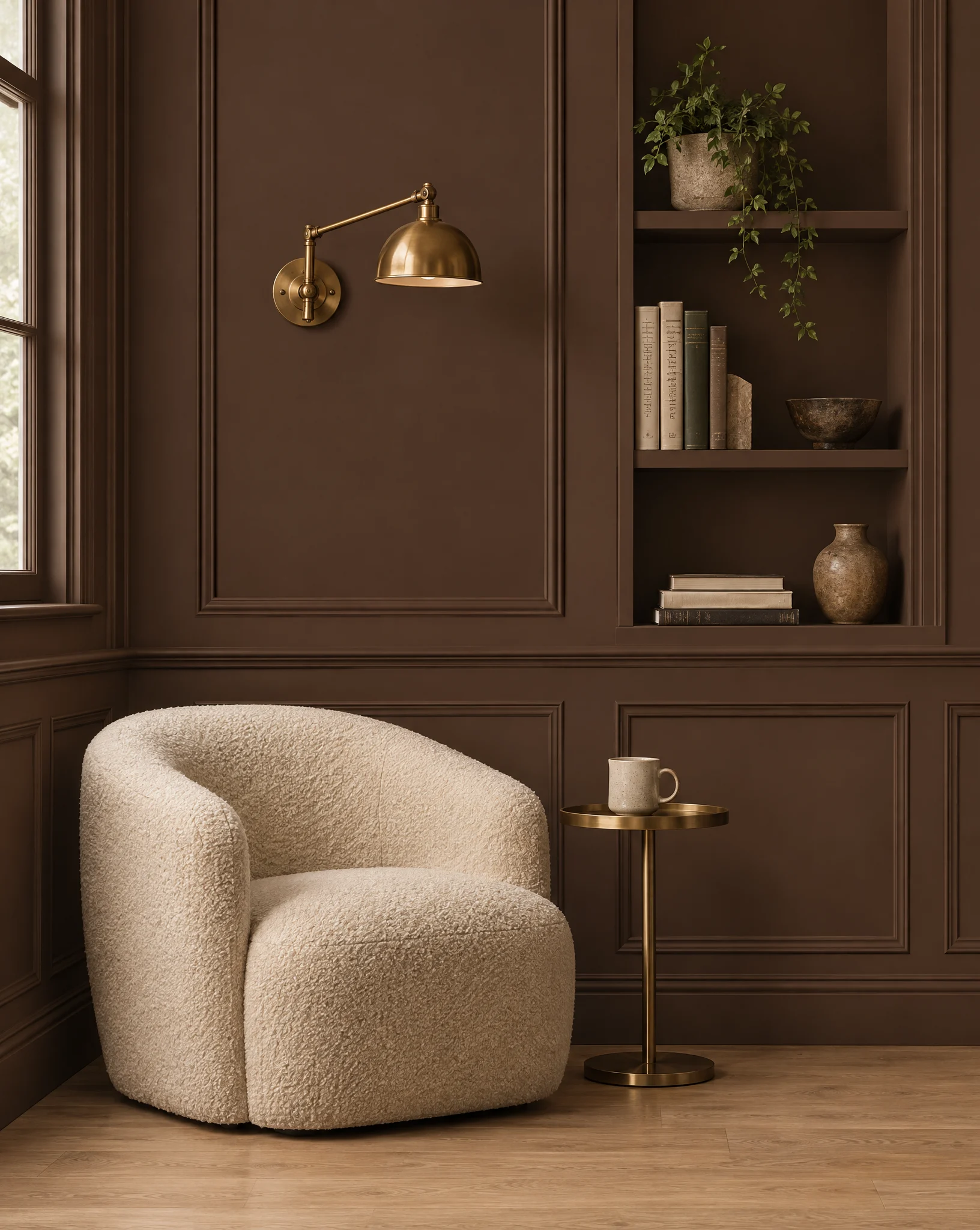
Sherwin-Williams · SW 6076Turkish Coffee
A deep, rich espresso brown. It is not a color of the year, but a dark brown like this is a warmer choice than black or charcoal.
Where it works
We like it on built-ins, cabinets and front doors, or on every wall of a den or powder room. Cream trim and brass hardware keep it warm instead of heavy.
Color-of-the-year names, codes and descriptions come from each brand's 2027 announcement. Sources: Benjamin Moore, Sherwin-Williams, Behr, Better Homes & Gardens, Sherwin-Williams top colors.
Favorites that never go out of style
Best-selling colors from Sherwin-Williams and Benjamin Moore that homeowners come back to year after year. Swatches are screen approximations.
Chantilly Lace
BM · OC-65
White Dove
BM · OC-17
Pure White
SW · 7005
Alabaster
SW · 7008
Edgecomb Gray
BM · HC-173
Agreeable Gray
SW · 7029
Accessible Beige
SW · 7036
Repose Gray
SW · 7015
Revere Pewter
BM · HC-172
Sea Salt
SW · 6204
Evergreen Fog
SW · 9130
Chelsea Gray
BM · HC-168
Kendall Charcoal
BM · HC-166
Urbane Bronze
SW · 7048
Hale Navy
BM · HC-154
Iron Ore
SW · 7069
Naval
SW · 6244
Tricorn Black
SW · 6258
Wondering how one of these looks in your home? Try it on a photo.
Try a colorChoosing a color you'll love
A trend color can look great for years. These habits help you pick one that fits your home, not just this season.
Test it on your own wall
Paint a large sample on two walls and look at it in the morning, at midday and at night. A color on a screen or a tiny chip can look very different in your light.
Start small with a bold color
A front door, a kitchen island or a powder room is a low-risk way to live with a trend color before you paint a whole room.
Check what stays
Floors, counters, tile and stone are not changing. Hold your sample next to them and make sure the undertones get along.
Pick the finish with the color
Walls, trim, doors and cabinets each want a different sheen. The same color can look softer or richer depending on the finish.
Bold color on our own jobs
Trends are a starting point. Here are a few real Goodwork projects where the right color made the job.
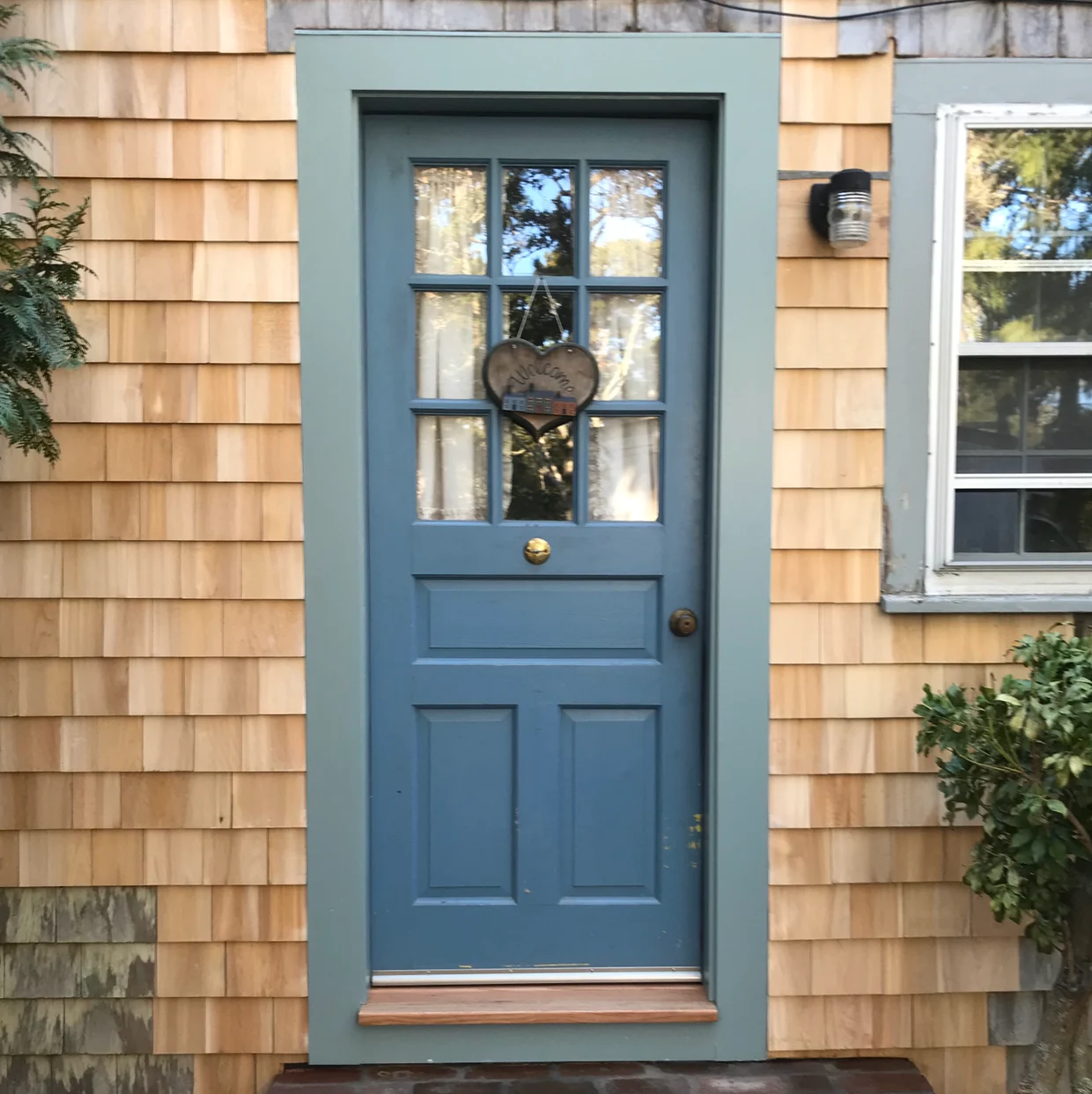
A deep blue door and soft green-gray trim against fresh cedar shingles.
Exterior painting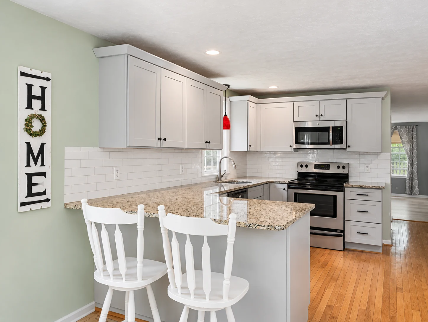
Shaker cabinets painted a calm gray.
Cabinet painting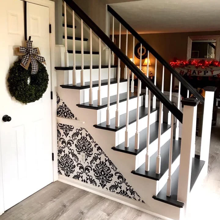
A staircase in crisp black and white.
Stair painting
What clients say.
Five-star reviews from homeowners we've painted for.
“Owner and workers very pleasant to deal with. They were on time very neat, and the job came out great. I would gladly work with them again.”
“It was great. It came out fantastic. They left everything clean. Everything was done right the first time.”
“They were good. Very punctual. Very courteous. Workmanship is very good. I would highly recommend him.”
“Great! Beautiful work, reliable and professional.”
Have a color in mind?
Tell us the room and the color you're thinking about. We'll reach out, usually the same day, to set up a visit.